Larkhollow (demo site) · Web design
Wedding Venue - Demo Site
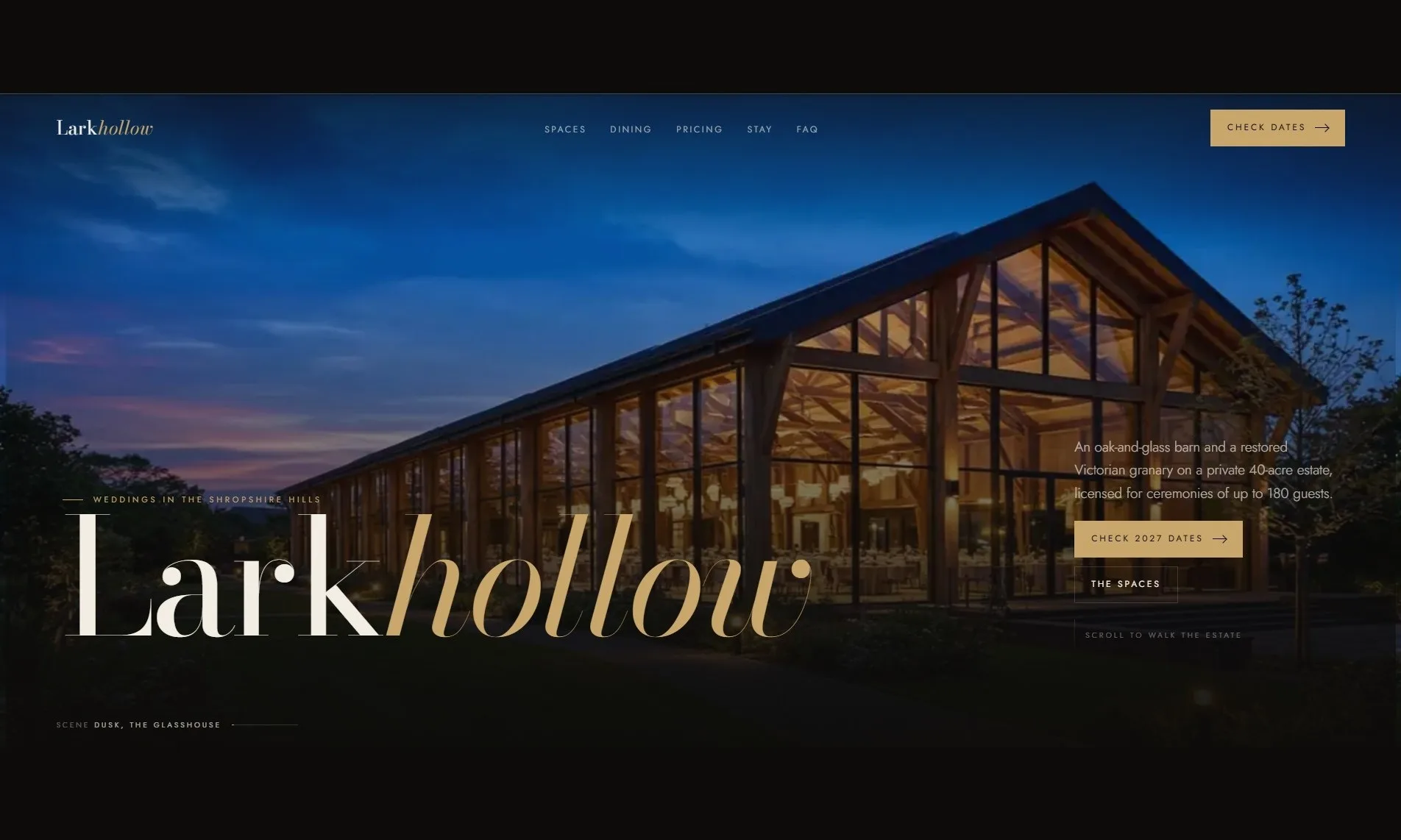
A concept demo for a wedding venue: one long editorial page with a film of the estate running behind it, scrubbed by the scroll, ending in seasonal pricing and an enquiry form. Larkhollow is a fictional venue, built to show what the format can do.
View the site live: wedding-venue.build-bros.co.uk (opens in a new tab)
A look around the site
Results
- Format
- A 255 frame film of the estate, scrubbed by the scroll
- Pricing
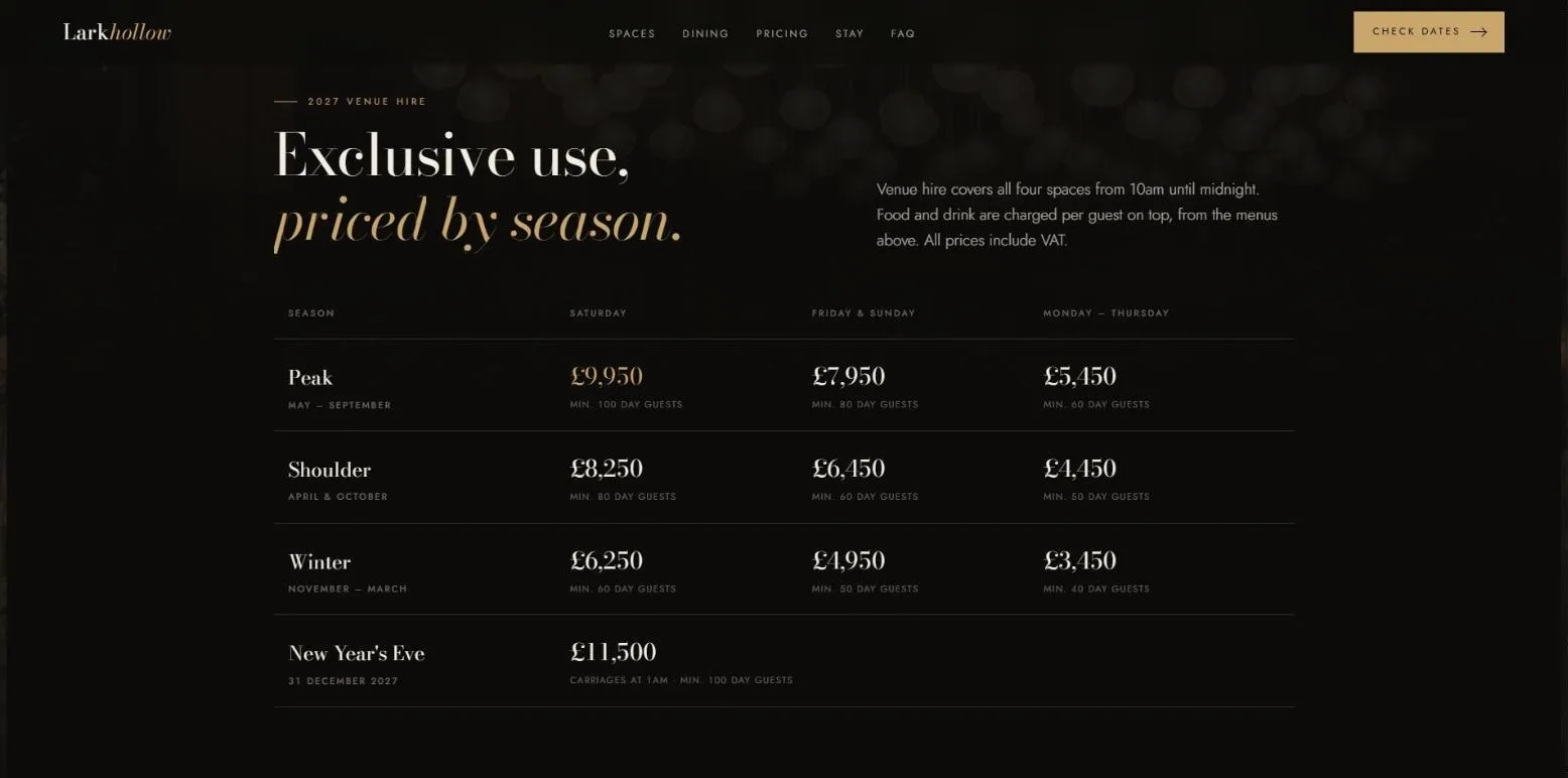
- Seasonal rates published openly, so enquiries self-qualify
- Motion
- Switched off entirely under reduced motion
- Status
- Concept demo, fictional venue, illustrative figures
About this project
This is a demonstration, not a client project. Larkhollow is an invented venue, and the prices, capacities and dates on it are illustrative rather than anybody's real figures. We built it to show wedding venues what is possible on their own site, because the format is difficult to describe and obvious the moment you scroll it.
The problem it answers
A wedding venue sells one thing above all: the feeling of the place on the day. Most venue sites try to carry that with a gallery, which asks the visitor to click through thumbnails and assemble the day in their head. Meanwhile the couple is comparing four venues at once, usually in the evening, usually on a phone.
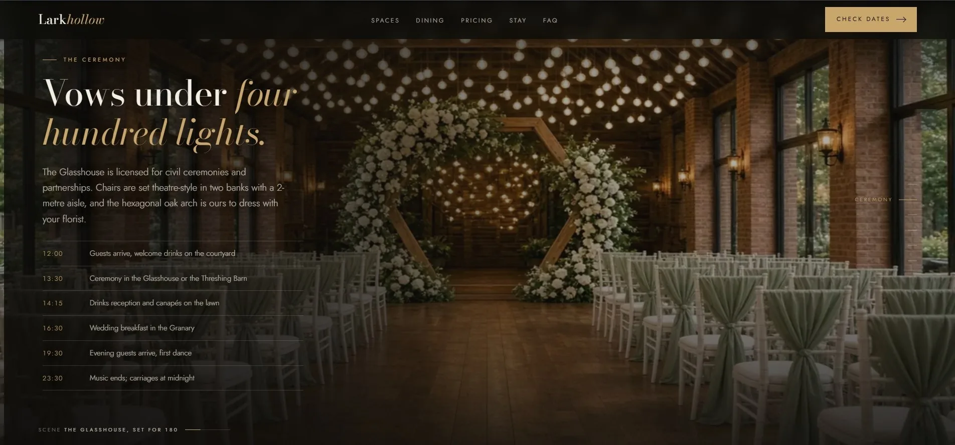
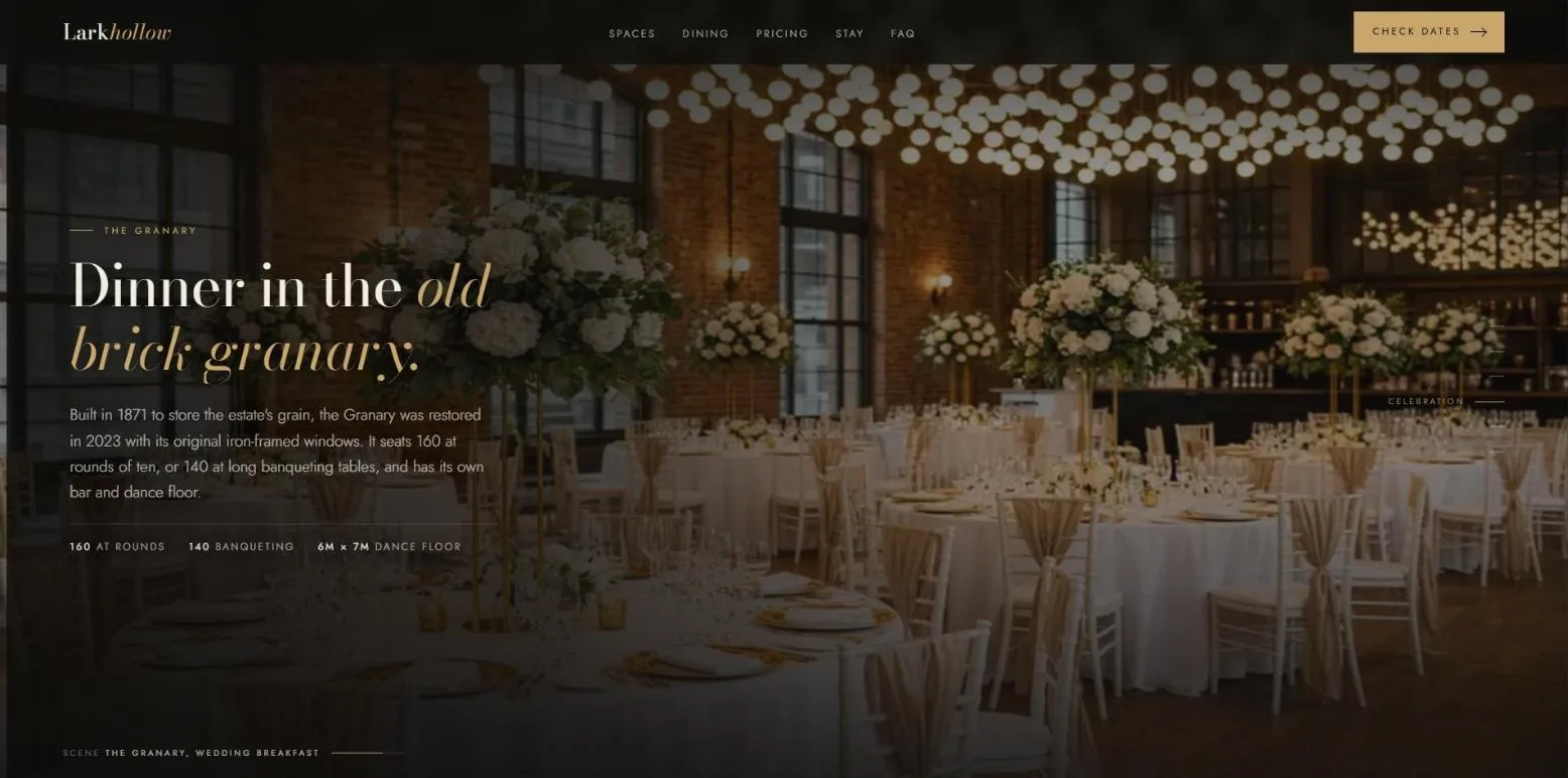
So this demo takes the opposite approach. The whole page sits over a film of the estate that runs from the approach at dusk, through the ceremony, into the evening, and the scroll is what plays it. The visitor does not press anything. They read, and the day moves behind the words.
How it is built
The film is a sequence of 255 still frames drawn to a canvas, not a video. That is what makes it scrub precisely in both directions, forwards and backwards, at whatever speed somebody reads. The frames load coarse to fine, so a one in eight skeleton of the whole film is in place before the page reveals itself and the scrubbing works while the rest arrives behind it.
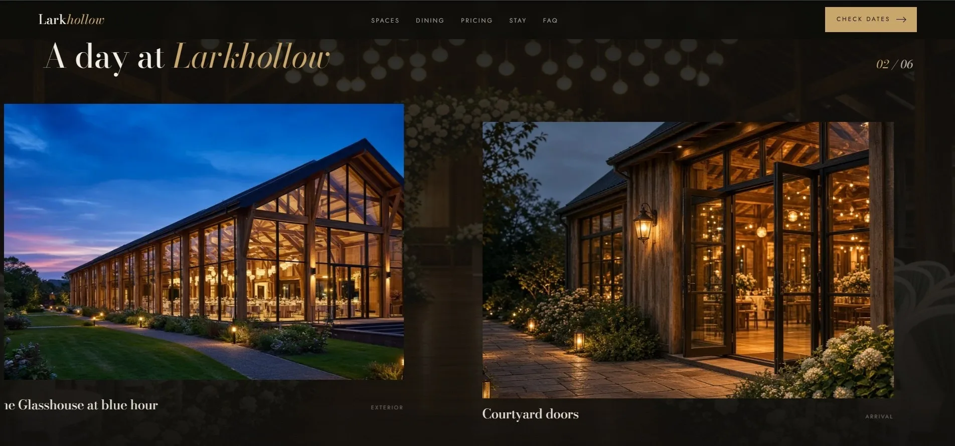
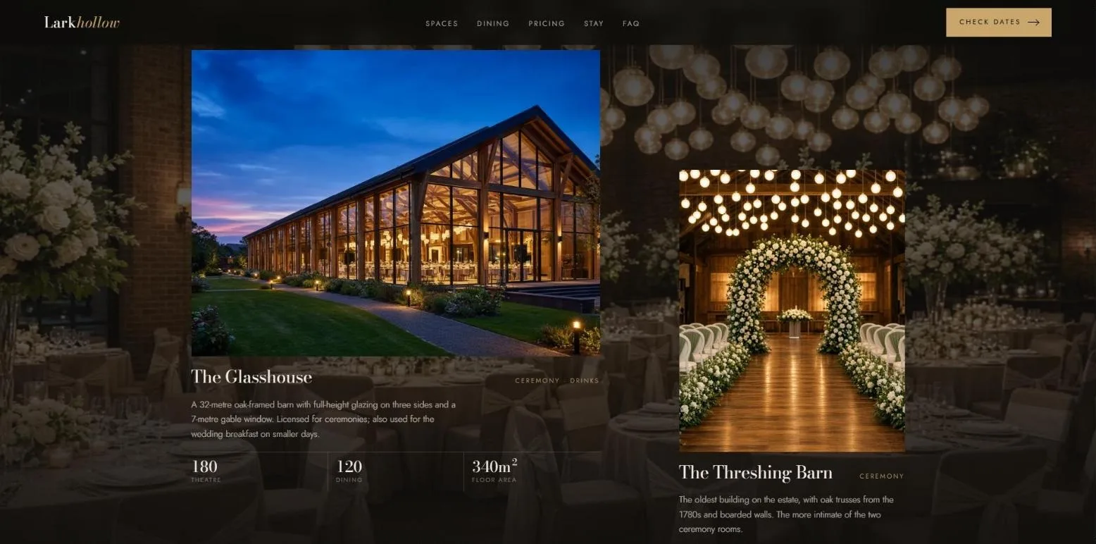
Over that sits ordinary, readable editorial copy in alternating columns, a chapter rail down the right-hand side marking where in the day the visitor is, and then a set of solid panels where the page stops performing and starts answering questions: the four spaces with their capacities, the menus, the accommodation, the seasonal price table, the FAQ and the enquiry form.
The practical half
The part that matters commercially is the bottom of the page. Venue hire is priced openly by season and by day of the week, with the minimum guest numbers next to each figure, the deposit terms, a worked example of what a typical Saturday comes to, and a note that registrar fees are paid elsewhere. A couple who reach the enquiry form have already self-qualified on budget, which is the single most useful thing a venue site can do for the people answering the enquiries.
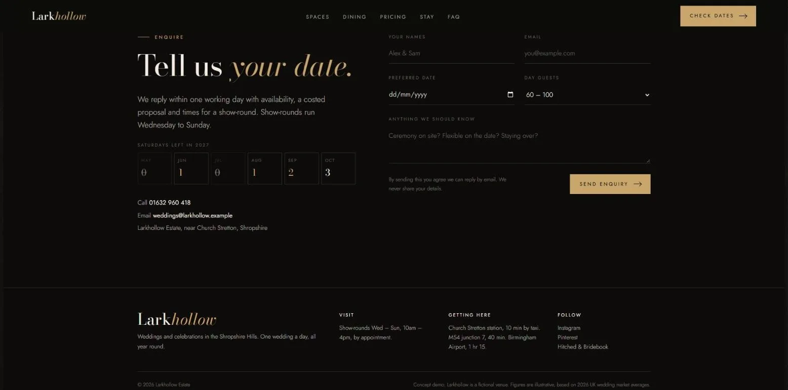
The form itself is a demonstration and says so when it is submitted: nothing is sent. On a live build it would email the venue and acknowledge the enquirer, as the booking and enquiry forms on our client sites do.
Accessibility and motion
A page built on movement has to work for people who do not want it. Under prefers-reduced-motion the easing, the parallax and the counting figures are all switched off and the page settles straight onto each scene instead of gliding between them. Every control is keyboard operable with a visible focus ring, the images carry real alt text, and the copy is readable without any of the motion happening at all.
What it demonstrates
- Scroll-scrubbed frame sequence rendered to a canvas, forwards and backwards
- Progressive coarse-to-fine frame loading behind a loading gate
- One-page editorial layout with a chapter rail
- Gallery, spaces and capacities, menus and accommodation sections
- Seasonal venue hire pricing table with deposit and minimum numbers
- FAQ and enquiry form
- Reduced-motion fallback and keyboard-operable controls
- Mobile-first responsive layout
If you run a venue and want to see your own place in this format, book a call and we will talk through what it would take.